Showing posts with label 1950s. Show all posts

[jemcn] Download Privilege Sign JNL fonts from Jeff Levine

Privilege Sign JNL


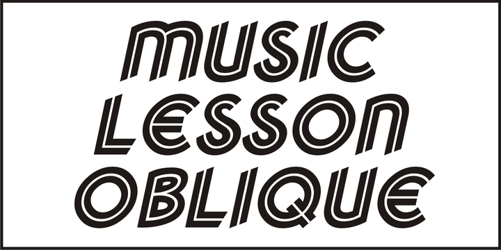
The above-the-store signage for many newspaper stands, soda shops, candy stores, luncheonettes and pharmacies of the 1950s and early 1960s were what was referred to as “privilege signs” provided by one of the major cola brands.


Consisting of the brand’s emblems on the left and right, the remainder of the sign would carry the desired message of the storekeeper (such as “Candy – Soda – Newspapers”) in prismatic, embossed metal letters.


Inspired by these vintage signs, Privilege Sign JNL recreates the condensed sans serif lettering style in both regular and oblique versions. The typefaces are solid black, but adding a selected color and a prismatic effect from your favorite graphics program can reproduce the look and feel of those old businesses.


Privilege Sign JNL


[yajqb] Download Municipal Pool JNL fonts from Jeff Levine

Municipal Pool JNL


A photo of the now closed [circa-1953] Lowell Municipal Pool (at 1601 N. 28th St.) in Boise, Idaho shows the words “Municipal Pool” formed into the cement of the entrance to the above-ground swimming facility.


Both the lettering and building entrance designs harken back to the Art Deco era and the sign features stencil-like characters.


This inspired a typeface aptly named Municipal Pool JNL, and is available in both regular and oblique versions.


Municipal Pool JNL


[qvknf] Download Teenagers JNL fonts from Jeff Levine

Teenagers JNL


Inspired by the hand lettered opening credits for “(The Many Loves of) Dobie Gillis” – a teen-oriented televisioncomedy that ran from 1959 to 1963 on CBS - Teenagers JNL is available in both regular and oblique versions.


Teenagers JNL


[gtyoe] Download Parking Lot Sale JNL fonts from Jeff Levine

Parking Lot Sale JNL


Here’s a novelty font emulating the plastic pennant streamers that were popular in the 1950s and 1960s used to decorate a store parking lot or used car lot for a sales event.


The typeface inside the individual pennants is Manufacturer JNL, which can be used for body copy associated with titles made by this font.


Parking Lot Sale JNL is available in regular (black letters on white pennants) and black (with white letters). A blank pennant for word spacing or end caps is available on the backslash key.


Parking Lot Sale JNL


[lvnnh] Download Girard fonts from House Industries

Girard


Whatever the medium, Girard’s love for typography was the common thread that wove his work together. We are honored that the Girard family has entrusted us to celebrate and expand upon the legacy of this design icon with this collection of fonts. The Girard Slab family gracefully synthesizes illustrative sensibilities into a practical typographic framework. Slab’s three widths and four weights ensure versatility in a modern editorial setting while its gentle curves transcend the sterility of traditional typography to add an unprecedented warmth and personality. From boutique chocolate packaging to the titling sequence for an indie vegan superhero cartoon, Girard Script deftly adds a contemporary sophistication to text and display settings. Inspired by a workhorse lettering style that helped Alexander Girard implement thousands of design elements in his overhaul of the Braniff identity system, Girard Sky pulls its weight in any contemporary application. In Girard Sansusie, each character stands alone as an illustrative element while coming together with its counterparts as a whimsical yet functional typeface.

FEATURES:

  • The ligatures feature substitutes specially-drawn letter combinations that combine two, three or even four characters to create smoother transitions and simulate lettering sensibilities.
  • Girard Slab’s three widths and four weights ensure versatility in a modern editorial setting while its gentle curves transcend the sterility of traditional typography to add an unprecedented warmth and personality.
  • Copious alternate characters and “smart” OpenType programming allow Sansusie to escape the rigid confines of typography to come alive as if flowing from Girard’s sketchpad. This animation shows a sampling of the swash characters available in the font.

GIRARD CREDITS:

  • Typeface Design: Alexander Girard, Ben Kiel, Ken Barber, Laura Meseguer
  • Typeface Production: Ben Kiel
  • Typeface Direction: Christian Schwartz, Andy Cruz, Ken Barber


Like all good subversives, House Industries hides in plain sight while amplifying the look, feel and style of the world’s most interesting brands, products and people. Based in Delaware, visually influencing the world.


Girard


Belinda New fonts from Mika Melvas - (jnlfp)

Belinda New


Belinda New is an updated version of the original Belinda which I designed in 2011. Belinda New is a smooth and lining brush script font with a vintage and retro feel. It has two sets of uppercase and many alternates for lowercase letters. It is a good choice to use in logos, headlines and packages. You can also match it with a serif or sans serif fonts and use it as a secondary font in web design, magazines and branding.


Belinda New


[liyvnpvpnh] Download Klangfarbe Script Fonts Family From Mysterylab

Download Klangfarbe Script Fonts Family From Mysterylab

Download Now
Server 1
Download Now
Server 2
Download Now
Server 3


Klangfarbe is a quirky ultramodern script with unique stroke tapers and droplet-like finials. This font is a true chameleon and is very much at home with a variety of looks: from a reimagining of kitschy 1950s scripts, to analog retro-tech, to steampunk, to high-fashion futuristic logos and beyond. Klangfarbe — a German language term meaning “timbre” or “sound color” — references the visual appearance of audio frequency waveforms echoed in many of the lowercase letters. A truly eye-catching choice.


Download Klangfarbe Script Fonts Family From Mysterylab


Download Klangfarbe Script Fonts Family From Mysterylab


[ijxletajdx] Download Reform School JNL Fonts Family From Jeff Levine

Download Reform School JNL Fonts Family From Jeff Levine


The extra bold sans serif stencil lettering on movie posters and lobby cards for “Reform School Girl” (a 1957 film by American International Pictures) was the basis of Reform School JNL, which is available in both regular and oblique versions. 


Download Reform School JNL Fonts Family From Jeff Levine


Download Chonky Fonts Family From Typesenses

Download Chonky Fonts Family From Typesenses

Download Now
Server 1
Download Now
Server 2
Download Now
Server 3


Say hello to the new workhorse for packaging and advertising design! Chonky — playful version of chunky — is a bold script font based on the former English calligraphy but with touches of the vitality that the commercial lettering of 1950s had, and it is mostly inspired in the work of the master Doyald Young and his lessons. Following the advice where he explains that boldness requires simple forms, this modern typeface wasn’t designed to imitate calligraphy but it was typographically thought, being as minimal as a script could be. The eye was put on legibility as well as on spacing and connections, which were specially cared, as it is usual in all Typesenses’ scripts. The upright axis makes the curves slower while the rounded terminals give a warm look. The ascenders, descenders and capitals are the shorter they could be, mostly in the Regular style. The Poster font, has larger ones in order to achieve more graceful forms. Both options include stylistic sets and ligatures to embellish the words. Just keep the Standard Ligatures and Contextual Alternates features always active and see how the typeface writes perfectly while having fun with OpenType alternatives (*). Additionally, Chonky has extensive Western, Central and Eastern European language support. 

Due to its classical base mixed with modern touches, this is a typeface that will live for decades instead of fading away with fashion.

(*) Take a look at the User Guide to see all the features available.


Download Chonky Fonts Family From Typesenses


Download Chonky Fonts Family From Typesenses


Download Music Lesson JNL Fonts Family From Jeff Levine

Download Music Lesson  JNL Fonts Family From Jeff Levine

Download Now
Server 1
Download Now
Server 2
Download Now
Server 3


During the 1940s and 1950s, the Miller Music Corporation issued a number of its songs with a stock cover design for their “Miller Series of Piano Solos” but the song titles were hand lettered in an Art Deco dual line design. Recreated digitally as Music Lesson JNL, this type design is available in both regular and oblique versions.

Download Music Lesson  JNL Fonts Family From Jeff Levine
Download Music Lesson JNL Fonts Family From Jeff Levine


Download Music Lesson JNL Fonts Family From Jeff Levine


Download Indecise Fonts Family From Tipo Pèpel

Download Indecise Fonts Family From Tipo Pèpel


Even though the name seems not to tell much, Indecise shows a clean and coherent design. The shapes of the characters reference the Latin typefaces that were promoted by great figures like Enric Crous-Vidal and José Mendoza y Almeida in the 50s. Indecise uses the body of incise typefaces and gets rid of the subtle terminals for the strokes. It is a high-contrast sans divided into 5 elegant subfamilies, which use different widths. From the condensed version to the extended one, the family includes 50 fonts counting upright and italic. This collection of widths make for many possible combinations of styles. Indecise is a humanist typeface, it puts geometry apart and embraces the calligraphic gesture. This helps to suggest the movement of the strokes while avoiding to create text with a static appearance. Thin and thick strokes come together and define a smooth rhythm for reading.


Download Indecise Fonts Family From Tipo Pèpel


Download Riley Fonts Family From Fenotype

Download Riley Fonts Family From Fenotype


Riley is an elegant brush Script with its roots in the 1950s American sign painting. Riley has Stylistic Alternates for every lowercase standard character and it’s equipped with Contextual Alternates and Ligatures that keep the flow and connections smooth. Riley is great for headlines and posters or as a logotype with an elegant touch.


Download Riley Fonts Family From Fenotype


Download Unicorn Fonts Family From DavidMatos

Download Unicorn Fonts Family From DavidMatos


Unicorn is a super-condensed Display with a blasé feeling. It was firstly inspired by a lowercase set seen on a furniture ad in Domus (the architecture magazine) #192, from 1943. For best results, use with a bright & smart colour palette. Appointed by the Unicorn. Of course.


Download Unicorn Fonts Family From DavidMatos


Download Spooktacular Font Family From Aiyari

Download Spooktacular Font Family From Aiyari


Spooktacular font family is the fusion of beatnik movement on 1950's, vintage horror movie, and vintage comics. The typeface offer the magics of open type features such contextual alternate and stylistic alternate which make the typeface looks more playful. Spooktacular comes with extra doddle dingbats to make your design looks perfect. Spooktacular Font Family best uses for headings, Logo type, quotes, apparel design, invitations, flyer, poster, greeting cards, product packaging, book cover, printed quotes, cover album, movie, etc


Download Spooktacular Font Family From Aiyari


Download Fairlady Font Family From Studio Indigo

Download Fairlady Font Family From Studio Indigo


Fairlady is a somewhat chunky script font that is developed from my own handlettered brush letters. My idea was to design a bold cursive script font with a strong 1950's vintage feeling to it. Fairlady is a decorative and quite tightly spaced font with preserved legibility which makes it perfect for vintage cards, labels, posters, logos, packaging and more. It has multilingual support for most European countries.


Download Fairlady Font Family From Studio Indigo


Download Starfire Font Family From MADType