[gtyoe] Download Parking Lot Sale JNL fonts from Jeff Levine

Parking Lot Sale JNL


Here’s a novelty font emulating the plastic pennant streamers that were popular in the 1950s and 1960s used to decorate a store parking lot or used car lot for a sales event.


The typeface inside the individual pennants is Manufacturer JNL, which can be used for body copy associated with titles made by this font.


Parking Lot Sale JNL is available in regular (black letters on white pennants) and black (with white letters). A blank pennant for word spacing or end caps is available on the backslash key.


Parking Lot Sale JNL


[tmyff] Download Courtroom JNL fonts from Jeff Levine

Courtroom JNL


Erle Stanley Gardner’s beloved lawyer “Perry Mason” first appeared on screen in a series of six films with Warren Williams starring in four of them. The hand lettered opening title for 1935’s “The Case of the Lucky Legs” is a classic Art Deco sans serif design, and is now available as Courtroom JNL in both regular and oblique versions.


Courtroom JNL


[yuhdw] Download Pleasant Show Card JNL fonts from Jeff Levine

Pleasant Show Card JNL


A beautiful and stylish pen lettered alphabet appears within the pages of the 1921 publication “How to Write Show Cards” and its Art Nouveau stylings made it a perfect candidate for a digital revival.


Pleasant Show Card JNL is available in both regular and oblique versions.


Pleasant Show Card JNL


[qzrzz] Download Stocks and Bonds JNL fonts from Jeff Levine

Stocks and Bonds JNL


The hand lettered opening title for the 1935 movie “Thanks a Million” is rendered in a condensed, thick and thin Art Deco sans serif design.


It is now available as the digital typeface Stocks and Bonds JNL – in both regular and oblique versions.


Stocks and Bonds JNL


[lvnnh] Download Girard fonts from House Industries

Girard


Whatever the medium, Girard’s love for typography was the common thread that wove his work together. We are honored that the Girard family has entrusted us to celebrate and expand upon the legacy of this design icon with this collection of fonts. The Girard Slab family gracefully synthesizes illustrative sensibilities into a practical typographic framework. Slab’s three widths and four weights ensure versatility in a modern editorial setting while its gentle curves transcend the sterility of traditional typography to add an unprecedented warmth and personality. From boutique chocolate packaging to the titling sequence for an indie vegan superhero cartoon, Girard Script deftly adds a contemporary sophistication to text and display settings. Inspired by a workhorse lettering style that helped Alexander Girard implement thousands of design elements in his overhaul of the Braniff identity system, Girard Sky pulls its weight in any contemporary application. In Girard Sansusie, each character stands alone as an illustrative element while coming together with its counterparts as a whimsical yet functional typeface.

FEATURES:

  • The ligatures feature substitutes specially-drawn letter combinations that combine two, three or even four characters to create smoother transitions and simulate lettering sensibilities.
  • Girard Slab’s three widths and four weights ensure versatility in a modern editorial setting while its gentle curves transcend the sterility of traditional typography to add an unprecedented warmth and personality.
  • Copious alternate characters and “smart” OpenType programming allow Sansusie to escape the rigid confines of typography to come alive as if flowing from Girard’s sketchpad. This animation shows a sampling of the swash characters available in the font.

GIRARD CREDITS:

  • Typeface Design: Alexander Girard, Ben Kiel, Ken Barber, Laura Meseguer
  • Typeface Production: Ben Kiel
  • Typeface Direction: Christian Schwartz, Andy Cruz, Ken Barber


Like all good subversives, House Industries hides in plain sight while amplifying the look, feel and style of the world’s most interesting brands, products and people. Based in Delaware, visually influencing the world.


Girard


[gzkch] Download Off Duty JNL fonts from Jeff Levine

Off Duty JNL


The free form hand lettering from the titles and credits of the 1964 French film comedy “Le Gendarme de Saint-Tropez” [“The Policeman from Saint-Tropez”] was the basis for Off Duty JNL – which is available in both regular and oblique versions.


Off Duty JNL


[mlegs] Download Last Tango JNL fonts from Jeff Levine

Last Tango JNL


The hand lettered title found on the 1924 sheet music for the tango “Sentimiento Gaucho” (“Sentimental Gaucho”) offered a different take on the thick-and-thin lettering that permeated the late 1920s through the Art Deco age.


A ‘slash’ or ‘swipe’ is cut through the characters (similar to “Directa JNL” – another take on this type of design).


Last Tango JNL is the digital recreation of this novelty lettering and is available in both regular and oblique versions.


Last Tango JNL


[qpgxk] Download Stocks and Bonds JNL fonts from Jeff Levine

Stocks and Bonds JNL


The hand lettered opening title for the 1935 movie “Thanks a Million” is rendered in a condensed, thick and thin Art Deco sans serif design.


It is now available as the digital typeface Stocks and Bonds JNL – in both regular and oblique versions.


Stocks and Bonds JNL


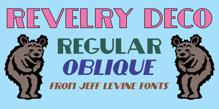
[bggij] Download Revelry Deco JNL fonts from Jeff Levine

Revelry Deco JNL


The namesake for this type design was the dust jacket for the 1926 book “Revelry”.


A classic Art Deco thick-and-thin design, Revelry Deco JNL is available in both regular and oblique versions.


Revelry Deco JNL


[bpogg] Download Fun Time Nouveau JNL fonts from Jeff Levine

Fun Time Nouveau JNL


“One Hundred Alphabets for the Show Card Writer” was published in 1919 to afford sign artists the ability to create signs and show cards in then-contemporary lettering styles.


One such alphabet was big, bold and representative of the Art Nouveau stylings popular in the early part of the 20th Century. Most likely it was applied to store sales and public events that were casual and informal, for its letter forms are free of any constraints.


This design is now available as Fun Time Nouveau JNL in both regular and oblique versions.


Fun Time Nouveau JNL


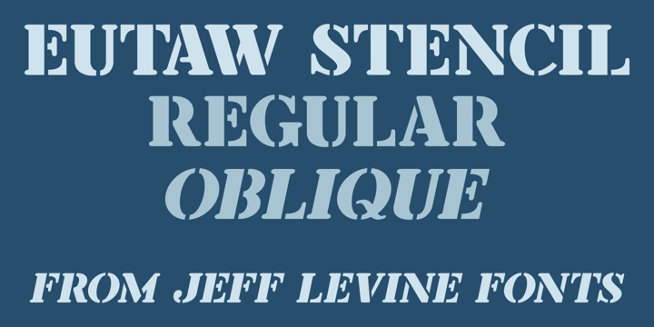
[dqhtr] Download Eutaw Stencil JNL fonts from Jeff Levine

Eutaw Stencil JNL


A hand lettered emulation of a Roman stencil type face on the cover of the folio for the Stenso School Set was the basis for Eutaw Stencil JNL, which is available in both regular and oblique versions.


The Stenso School Set (circa 1940-41) was comprised of three stencils – two lettering guides and a map of the [then] 48 United States.


Developed and patented by Baltimore school teacher Ruth Libauer Hormats, her stencils were the first to offer a system for accurate letter spacing and ease of use.


“Eutaw” (as part of the font’s name) is taken from Eutaw Place, the street where Ruth and her husband lived at the time of Stenso’s inception. To the Cherokee, the name means “Creek Indian”.


Eutaw Stencil JNL